
The Alice Cooper logo
Moderators: Devon, Gorehound, Si, SickThings, Shoesalesman
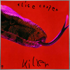
The Alice Cooper logo
Why? Why do they continue to mess with the logo? For W2MN, the splattered it up. In 2017, they stretched the "A." Now, they've lopped off the bottom of the "OO's." Ernie Cefalu created a timeless look with that logo in 1986, as he stated right here in this forum. These updates look like someone believes that they can improve upon it. Not in my opinion. Please stop.
Move aside, mere drop of water - let the ocean pass.
Re: The Alice Cooper logo
This thread is useless without pics!
Re: The Alice Cooper logo
HERE is a quick comparison. I am the first to admit that these things probably don't matter much to anyone else. It can be argued that each iteration of the logo is it's own work of art. My position is that messing with the logo is messing with the brand. Alice is constant, like Coca-Cola. Pepsi looks they are always chasing rainbows whenever they change their logo. They come across as accepting the fact that they are permanently in second-place. As much as I liked the cover for W2MN, that logo always seemed like it came on too strong. It is obviously a re-working of the original (see the scribbly parts of the "E's" and the "R.") I have never equated 'Alice' with 'splatter,' that's why I don't like it. The stretched "A" for Paranormal is apparently just a different crop of the original logo, and it looks lopsided to me. The new one (Don't Give Up) looks like it has a bit more flow without the bottom parts of the "OO's," but Alice doesn't wear just the top parts of his eye make-up - which was the whole point of the "OO's" in the first place. Hey, there are plenty of ways to present Alice - look at the artistic logos for ACGH, WTMN, DD, etc... It would be nice to have more of that. I find it kind of annoying to see the career-defining 1986 logo getting messed with. If it ain't broke...
Move aside, mere drop of water - let the ocean pass.

Re: The Alice Cooper logo
Though the first logo posted is the definitive one when I think of Alice Cooper, he doesn't quite have an iconic logo the way that bands like Iron Maiden, Judas Priest, or Metallica do. In fact, I'd honestly never really thought of the logos on those later albums as being problematic because they seem like just one of many logos.
Re: The Alice Cooper logo
After looking at them I don't see a problem to be honest. Variations on a theme.
-
Saint&Sinner
- Fashion Flusher

- Posts: 675
- Joined: Sun Sep 13, 2015 12:59 pm
Re: The Alice Cooper logo
i like the 86 original,
i have no issue with W2MN logo iteration , didnt fit the record but was cool.
The chopping off the bottom of the "o" is odd to me and looks like a mistake but maybe thats just me.
Understandably alice wanted a "brand" logo, makes sense. But then why mess with it?
i have no issue with W2MN logo iteration , didnt fit the record but was cool.
The chopping off the bottom of the "o" is odd to me and looks like a mistake but maybe thats just me.
Understandably alice wanted a "brand" logo, makes sense. But then why mess with it?


Re: The Alice Cooper logo
If I may give my take on the Alice Cooper logo it’s true Alice Cooper doesn’t have a singular logo like some other bands. Each album produces their own Alice Cooper logo that we all see on that release from tours to merchandise. The logo used the most is from “Constrictor”. When “Trash” was released it was used again on “Hey Stoopid” that has the same block letter logo. Then the “Constrictor” logo reappears for “Welcome 2 My Nightmare”, “Raise The Dead Live From Wacken”, “No More Mr Nice Guy Live!”, “Paranormal” and latest “Breadcrumbs”. So to me that seems like the most this logo has been used. Now I wonder if it will follow on the new release since Alice said that "Breadcrumbs" was a just a tease.
-
Daggers & Contracts

- Dada God

- Posts: 2821
- Joined: Mon Feb 04, 2013 5:47 pm
- Location: 340 Sanitarium
Re: The Alice Cooper logo
Commercial is as commercial does. Iconic as it may be. Labels always keep updating their products. Mrs. Butterworths lost her Do-Rag. Now, Land O' Lakes has kicked their Native American young lady to the curb. Things change & maybe it can increase sales. At least that's the thinking (until the customer doesn't recognize the product anymore). Just a retail opinion. D & C
I've Got The Answers To All Of Your Questions...
-
guttertrash
- Billion Dollar Baby

- Posts: 473
- Joined: Mon Aug 04, 2008 4:11 am
Re: The Alice Cooper logo
The newest iteration of the logo is odd to me because of the OOs. I never understood why it was brought back 25 years later (albeit in the more splattered look for W2MN). I never saw it as an iconic logo since it had not been used on any albums since Constrictor. Maybe it is because that was the logo used for his first rebirth, and the last decade has been seen and promoted as the same, but to me it just feels like a dated logo, no matter how they re-interpret it.
That being said, I personally prefer the plain fonts of the mid-90s for TLT and FFOA or the ACAS and TOD era.
That being said, I personally prefer the plain fonts of the mid-90s for TLT and FFOA or the ACAS and TOD era.
Re: The Alice Cooper logo
That's my point. I'd rather see them create something new than go back and futz with a masterpiece.guttertrash wrote: ↑Mon May 18, 2020 8:40 amThe newest iteration of the logo is odd to me because of the OOs. ...That being said, I personally prefer the plain fonts of the mid-90s for TLT and FFOA or the ACAS and TOD era.
I certainly hope the new album cover doesn't look rushed. The Sound of A, and Breadcrumbs are alarmingly similar. I know... Bitch, Bitch, Bitch.
Move aside, mere drop of water - let the ocean pass.
Re: The Alice Cooper logo
In case it's in question - I love Alice Cooper, and I am a geek when it comes to iconography.
Move aside, mere drop of water - let the ocean pass.
-
guttertrash
- Billion Dollar Baby
- Posts: 473
- Joined: Mon Aug 04, 2008 4:11 am
Re: The Alice Cooper logo
That's my point. I'd rather see them create something new than go back and futz with a masterpiece.Dannorama wrote: ↑Mon May 18, 2020 1:16 pm[quote=guttertrash post_id=305696 time=<a href="tel:1589791229">1589791229</a> user_id=999]
The newest iteration of the logo is odd to me because of the OOs. ...That being said, I personally prefer the plain fonts of the mid-90s for TLT and FFOA or the ACAS and TOD era.
I certainly hope the new album cover doesn't look rushed. The Sound of A, and Breadcrumbs are alarmingly similar. I know... Bitch, Bitch, Bitch.
[/quote]
I think you hit the nail on the head sadly. It seems like the album art, and the consistent use of the same logo albeit with minor tweaking, is almost an afterthought and/or rushed as of late. I’ve also been mostly critical with a lot of Alice’s output for over a decade now though. Breadcrumbs musically has at least given me a bit of hope though. The cover does seem tossed off to say the least.
-
padre_sliprat

- Dada God
- Posts: 854
- Joined: Thu Mar 31, 2011 6:40 pm
Re: The Alice Cooper logo
So what are your favourite Alice Cooper logos?
Mine are Easy Action and Welcome To My Nightmare.
Mine are Easy Action and Welcome To My Nightmare.
-
mr.barlow
Re: The Alice Cooper logo
I think he should go back to using the stellar logo that appeared on "Trash". That one was very original and really had heart!

Re: The Alice Cooper logo
Haha love this thread and all of you! Love splitting hairs about this artist we all love so darn much. Agree with most of the points in this thread!
If you call that guilty...then that's what I am